How to build a landscape architecture student portfolio that shows how you think
A practical guide for landscape architecture students: choosing projects, structuring case studies, showing process as well as finished drawings, writing captions, and keeping a portfolio honest and easy to read.

By Matthew Bovee · Upd. · 7 min
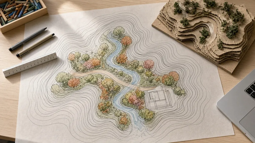
Every landscape architecture student eventually faces the same task: turn several years of studio work into a portfolio that someone else can understand in a few minutes. It is harder than it sounds. Studio projects are long, messy and full of decisions that made sense at the time. A portfolio has to compress all of that into a clear story.
I have rebuilt my own portfolio several times, each time after getting honest feedback from instructors and classmates. This article collects the advice that has helped me most. It is written for students, but it applies to anyone trying to show design work clearly.
What a portfolio is actually for
A portfolio is not an archive of everything you made. It is an argument: here is how I think, here is how I work, here is what I care about. The reader — an instructor, a reviewer, an employer or a graduate program — wants to know whether you can understand a site, ask good questions, develop ideas and communicate them.
That means the portfolio should show:
- Your thinking, through process sketches, diagrams and explanations.
- Your range, through a mix of project types and scales.
- Your skills, through drawings, models and technical work.
- Your voice, through what you choose to emphasize and how you write about it.
Choose fewer, stronger projects
The most common mistake I see, and made myself, is including too much. Four to six well-presented projects are usually stronger than ten thin ones. If a project needs a long apology to explain why it is weak, leave it out.
When I choose projects I ask:
- Does it show something the others do not? A different scale, a different site type or a different skill.
- Can I explain the main idea in one sentence? If not, I either clarify the idea or cut the project.
- Do I have the process material? Projects with only a final board are hard to present well.
- Am I proud of it now? Not when I finished it — now.
| Category | Example project types | Why it helps |
|---|---|---|
| Site scale | Courtyard, plaza, streetscape | Shows detail, materials and planting design |
| District or neighborhood | Corridor, campus, park | Shows systems thinking and connections |
| Ecological | Stormwater, creek, prairie restoration | Shows understanding of natural systems |
| Technical | Grading, construction details, planting plans | Shows you can make ideas buildable |
| Personal or exploratory | Sketchbook, research, test plots | Shows curiosity and voice |
Structure each project like a case study
A good project spread answers the same questions in the same order, so readers can follow quickly. I use a simple structure on my own projects page:
Context
Where is the site, what is the course or brief, and what is the scale?
Question
What problem or opportunity did the project address?
Analysis
What did you learn about the site, and how did it shape the design?
Concept
What is the big idea, in one sentence and one diagram?
Development
How did the design evolve? Show iterations and the decisions behind them.
Outcome
The final plan, sections, perspectives and details.
Reflection
What you learned, and what you would do differently.
The reflection is where many portfolios go quiet, but it is often the most interesting part. Saying what you would change shows judgment.
Show process, not just polish
Reviewers can tell when a project jumped from a site plan to a glossy render with nothing in between. Process material makes the work credible and shows how you think.
Good process material includes:
- Site analysis diagrams — sun, wind, water, circulation, views. I wrote about these in site analysis before you draw.
- Trace overlays and quick sketches, even rough ones.
- Study models, photographed simply.
- Iterations side by side, with a short note about what changed and why.
Polished drawings show what you made. Process shows why you made it.
Write captions that do work
Captions are often an afterthought, but they are how most people read a portfolio. A reader skims the images and reads the captions. Good captions explain what the image shows and why it matters.
Compare:
- Weak: "Site plan."
- Better: "Site plan: the main path follows the high ground, leaving the low area for a seasonal rain garden."
I try to write every caption so that someone who reads only the captions still understands the project.
Be honest about your role and the work
Portfolios should be accurate. If a project was a group project, say so and describe your role. If a drawing was produced with help, or if an image is a precedent rather than your own work, label it. Never claim recognition, clients or outcomes that did not happen. Studio projects are proposals, not built work, and it is fine to say that plainly.
Honesty is also practical. Reviewers ask questions. If your portfolio is accurate, every question is an opportunity to talk about your thinking.
Layout and design
A portfolio is itself a design project, but it should not compete with the work inside it.
- Use a consistent grid and a limited set of type sizes.
- Give images room. White space helps people see.
- Keep text short and placed consistently.
- Use one or two typefaces, chosen for legibility.
- Check it at small sizes, because many people will look at it on a phone.
- Keep the file size reasonable if you share a PDF.
Digital and print
Most portfolios are now shared digitally, either as a PDF or on a website. A personal site makes it easy to share a link, to add writing and to show longer case studies than a printed spread allows. That is part of why I built this site: it lets me pair projects with longer articles, like this one or my guide to prairie-inspired planting.
A short printed or PDF version is still useful for interviews and reviews. I keep a ten- to fifteen-page version for that purpose, with the full case studies online.
Get feedback early and often
The best improvements to my portfolio came from showing it to people before it felt finished. Instructors, classmates and practicing designers all notice different things. Ask specific questions: "Is the main idea of this project clear?" or "Which project would you cut?"
Drawing types and what they communicate
Different drawing types answer different questions. A portfolio that uses only one type — usually plans or renderings — leaves gaps in the story. I try to make sure each project uses a mix.
| Drawing | Best for showing | Tip |
|---|---|---|
| Site plan | Layout, circulation, relationships | Keep labels minimal; use a clear north arrow and scale |
| Section | Grade changes, planting layers, human scale | Include people silhouettes or furniture for scale |
| Diagram | One idea: water, sun, movement | One idea per diagram |
| Perspective | Experience and atmosphere | Show the place in more than one season if possible |
| Detail | Construction and materials | Pick one or two meaningful details, not many |
| Planting plan | Species, layers, density | Pair with a seasonal palette or images |
Sections are often underused in student portfolios, yet they are one of the clearest ways to explain landscape ideas. A single section through a rain garden or a creek bank can explain more than several plans.
Writing the project text
Most portfolio spreads need a short block of text: a title, a one-line summary and a paragraph or two. I try to keep the main paragraph under about 120 words and to use plain language. The goal is not to describe every element but to explain the main idea and the most important decisions.
A simple pattern that works for me:
- One sentence of context: site, scale and course.
- One sentence stating the challenge the project responds to.
- Two or three sentences on the main design moves and why.
- One sentence of reflection or an open question.
Writing this text early, before the layout is finished, also helps clarify which images the spread actually needs.
Common portfolio mistakes
- Too many projects and not enough depth in any of them.
- No process, only polished final images.
- Captions that only name the drawing rather than explaining it.
- Inconsistent layouts that make each project feel like a different document.
- Tiny text that cannot be read on a laptop or phone.
- Unclear authorship on group work.
A checklist before you send it
- Four to six projects, each showing something different.
- Every project follows a clear case-study structure.
- Process material is included, not just final drawings.
- Captions explain what each image shows and why it matters.
- Group work and your role are clearly labeled.
- No claims about recognition, clients or outcomes that are not true.
- Layout is consistent and readable on a phone.
- Someone else has reviewed it.
A portfolio is never finished. It changes as you learn and as your interests sharpen. If you are working on yours and want a second pair of eyes, I am happy to trade feedback — reach me on the contact page.
Last updated
Keep reading
Keep reading
7 min
For students
Site analysis before you draw: how to read a site in LincolnA step-by-step approach to site analysis for landscape architecture students: what to observe, how to document sun, wind, water, soils, circulation and use, and how to turn notes into diagrams that shape a design.7 min
Public space
Designing public space for Nebraska wintersHow to design plazas, streets and small parks in Lincoln that stay useful and attractive from November to March: sun, wind shelter, snow storage, materials, lighting, planting and programming for cold months.
7 min
Urban streams
Designing trails and edges along Lincoln's creeksHow landscape architects approach urban stream corridors in Lincoln: floodplains, stable banks, riparian planting, trail alignment, access to water and the long view of a creek as a shared public space.